Layout of a Tuxboard Dashboard
What makes up a Tuxboard dashboard? In this post, we look over the structure of a dashboard and explain the different types of components

What's Next?
- Introducing Tuxboard
- Layout of a Tuxboard dashboard
- Dashboard Modularity using Tuxboard
- Moving Widgets in Tuxboard
- Creating a Tuxbar for Tuxboard
- Managing Layouts in Tuxboard: Simple Layout Dialog
- Managing Layouts in Tuxboard: Advanced Layout Dialog
- Adding Widgets with a Tuxboard Dialog
- Using Widget Toolbars (or Deleting Widgets)
- Creating User-Specific Dashboards
- Creating Default Dashboards using Roles
- Creating Default Widgets using Roles
- Creating Custom Tuxboard Widgets
Full examples located at Tuxboard.Examples.
Dashboard layouts can become complex.
Depending on what kind of dashboard we're talking about, a dashboard could be made up of static widgets to display critical components in the system or they could be user-driven where the user controls the dashboard layout and amount of widgets on a layout.
Either way, once you understand a Tuxboard layout, you see other layouts in a similar fashion.
Overview of a Tuxboard Layout
The layout of a Tuxboard dashboard is very simple and consists of rows first, then columns second.
Here is one example of a Tuxboard layout.
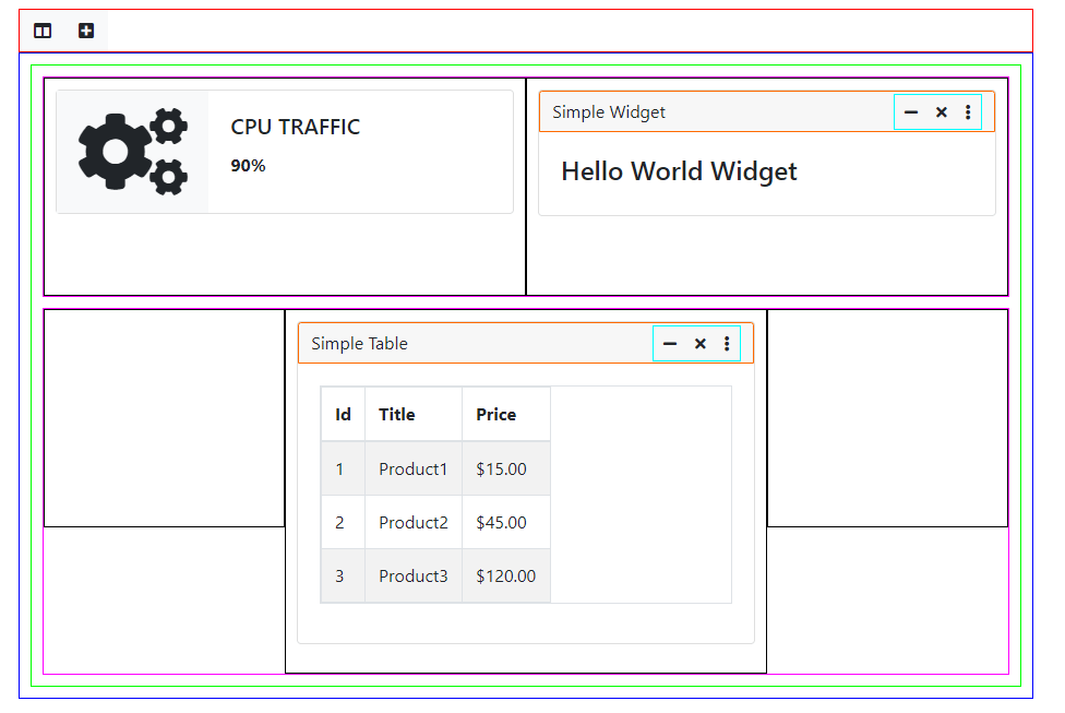
We'll start at the top and discuss each section.
Tuxbar

I felt one of the primary "accessories" for a dashboard was to have a toolbar and settled on the name Tuxbar.
In this toolbar example, we have a "Change Layout" button and an "Add Widget" button. You can add more buttons to the toolbar if you want (maybe a Refresh button) and even a text message to notify the user something completed successfully.
Of course, this toolbar is not absolutely necessary. If you want a static dashboard, a toolbar isn't necessary since it won't be a dynamic dashboard.
However, if you want a dynamic dashboard where users can add widgets and change layouts and interact with the dashboard in some way, the Tuxbar is a great accessory.
If you want to create your own toolbar, you can. We'll get into the details of the Tuxbar in a future post.
Tuxboard
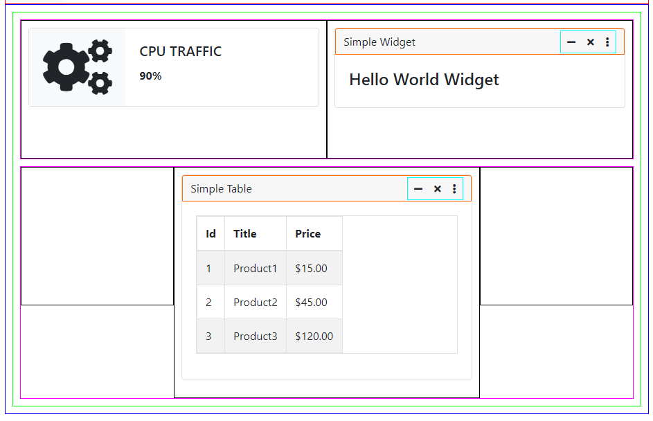
A Tuxboard dashboard is where all of the components come together. They're all data-driven including the widgets which we'll dig into later with a database schema post.
Dashboard Tab
This was a component meant for future expansion and didn't quite make it off the drawing board.
The component is represented with the green border in the above image. As the name implies, a DashboardTab was a "tab" container meant to hold a Layout (which is mentioned next).
With the intent of integrating multiple tabs (eventually), I wanted to abstract the tab container out from a layout in case a user wanted the same layout on multiple tabs.
Currently, the library only supports the use of one tab.
Layout
The Layout component is considered almost the same as a Dashboard Tab with one major difference: you can save pre-made layouts for specific users in the database.
What this means is a user could sign in as a blogger and receive, and have access to, default blogger widgets on the dashboard where if someone else signed in as an administrator, they would receive, and also have access to, administrator widgets as well as other widgets.
LayoutRow

Layout Rows define the rows used in a Layout (designated by the pink border around them).
In this example, we have a two-column LayoutRow. In the Tuxboard image above, we also have a three-column LayoutRow with one table widget in the middle.
You can have multiple LayoutRows in a Layout, but one Layout in a Dashboard Tab. Each LayoutRow is defined by a Layout Type.
LayoutType
Since we mentioned Layout Types, I feel we need to explain them more.
A LayoutType is meant to define the columns for a LayoutRow.
Out of the box, the LayoutType table contains four layout types:
| Title | Layout |
|---|---|
| Three Columns, Equal | col-4/col-4/col-4 |
| Three Columns, 50% Middle | col-3/col-6/col-3 |
| Four Columns, 25% | col-3/col-3/col-3/col-3 |
| Two Columns, 50% | col-6/col-6 |
For example, the LayoutRow above has a LayoutType of "Two Columns, 50%". The columns are defined by the slash delimiter and the column values are CSS classes applied to the HTML.
I wanted this approach for other CSS frameworks. So however your CSS framework defines columns, those are the CSS classes in the table.
This table is helpful for two reasons:
- In the Change Layout dialog, you can add new Layout Row types dynamically
- It's extremely simple to add LayoutTypes
Add a new type to the table and it's automatically available to the user for their LayoutRow.
Widget
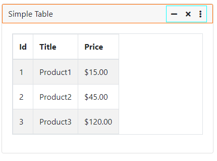
The Widgets are at the core of Tuxboard. You can add, move, and remove them from your dashboards.
Referenced by the light gray outline, these can be static widgets (identified by no header on the widget) or moveable widgets (contains a header).
If you are creating a custom widget template, make sure you have a header so you can "grip" the widget and move it around.
Widget Toolbar
At the far right in the widget's header is the widget toolbar (identified by the cyan outline).
What is the widget toolbar for? These are buttons defined specifically for your widget.
If you want to minimize your widget with just a header visible with no content, click the underline.
Don't want the widget on the dashboard? Click the 'x' to remove it.
The vertical dots represent a dropdown for additional widget functions if you want to add them.
General rule of thumb: place your most commonly-used functions for the widget on the header and place less commonly-used functions in the dropdown.
Dissecting Dashboards
Every once in a while, I receive an email about a creative platform selling dashboards and I click to see what kind of dashboards are available.
My problem is I start to dissect them as Tuxboard dashboards.
For example, creative-tim.com has a large selection of dashboards to purchase. I looked at one Corporate UI Dashboard's "live preview" and broke it down with Bootstrap 5 columns:
- LayoutRow 1 - 1 column (col-12) static Carousel widget
- LayoutRow 2 - 2 column (col-4/col-8) with one static chart and one static table
- LayoutRow 3 - 4 column (col-3/col-3/col-3/col-3) with 1 static widget in each column
Of course, there aren't any headers to move the widgets. This is what I would consider to be a static dashboard.
There's a large number of sample dashboards available. I even found another snazzy one called Vision UI Dashboard for React.
The whole idea of Tuxboard is to have underlying dashboard-legos at your disposal to create a snazzy front-end dashboard.
Every type of dashboard I've seen on the web could be repurposed as a Tuxboard dashboard.
Conclusion
In this post, we examined the layout and components of a Tuxboard dashboard along with the widgets and their associated components.
One of the books I've referred to in the past was the Information Dashboard Design: The Effective Communication of Data by Stephen Few. In Chapter 7, he mentioned to focus on the usability of dashboards and make sure your dashboard isn't a "cluttered mess."
In other words, remember it's a dashboard and only the most important information is meant to be displayed there. Don't try to cram 10 pounds of junk into a 5 pound bag (I'm trying to be PC with this old saying).
If the user needs more detail and decides to investigate the problem further, provide a link in the widget to the relevant location in your system so they can drill down and examine the problem further.
What's Next?
- Introducing Tuxboard
- Layout of a Tuxboard dashboard
- Dashboard Modularity using Tuxboard
- Moving Widgets in Tuxboard
- Creating a Tuxbar for Tuxboard
- Managing Layouts in Tuxboard: Simple Layout Dialog
- Managing Layouts in Tuxboard: Advanced Layout Dialog
- Adding Widgets with a Tuxboard Dialog
- Using Widget Toolbars (or Deleting Widgets)
- Creating User-Specific Dashboards
- Creating Default Dashboards using Roles
- Creating Default Widgets using Roles
- Creating Custom Tuxboard Widgets
Full examples located at Tuxboard.Examples.
