10 Tools I Use For Mobile Web Development (with 2 bonus tools)
What does your website look like on a smartphone compared to a desktop? Today, we'll cover 10 tools I use to build and test responsive, mobile websites.

Mobile is such a loaded term nowadays.
For example, what's the first thing you think of when you hear the word "mobile?"
You thought of a smartphone, didn't you?
Some people think of a native app running on Android or iOS like Twitter or Home Depot. Some think an app is a website.
In my eyes, if someone builds a "mobile website," it is considered "responsive" and the website looks great no matter what device you're viewing it on.
But when building a new website, what tools do you use to help in your mobile journey?
It's not as easy to just slap HTML, CSS, and JavaScript onto a page and you're done. There are many factors and considerations when designing the website for mobile responsiveness.
The Mobile Trend Continues
The continuing trend of websites lately is to have a mobile-first focus and having it work on numerous devices.
Desktop. LARGE desktops. Laptops. Tablets. Smartphones. TVs for Pete's Sake!
Developers and designers don't focus on just building a website, but a website that works across these multiple devices.
However, it's not as hard as it was 10 years ago. The tools weren't mature enough and had some drawbacks with browser inconsistencies.
Fast forward to today. Mobile development is now a mainstream topic for developers and designers to integrate yet another technology into websites to provide the maximum experience to their audience on whatever device they are holding at the time.
Today, we'll show you a collection of 10 tools to use for building and testing responsive websites on mobile devices.
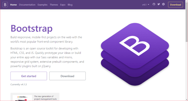
1. Bootstrap (or equivalent mobile responsive CSS library)
Let's talk about the obvious elephant in the room and get it out of the way, shall we?
The easiest way to create responsive websites is to understand how breakpoints work in each library you prefer.
Bootstrap is one such library.
Bootstrap is on it's 4th version, so it's definitely mature enough and provides additional JavaScript components to make your webapp even more functional for readers.
You are even reading a site that uses Bootstrap 100% (in case of RSS'd...DanylkoWeb).
Now, if Bootstrap won't work with your web project (which I can't imagine why it wouldn't), some alternative mobile responsive CSS libraries include Zurb's Foundation and Skeleton which work fantastic as well.
But there are a number of reasons I went with Bootstrap:
- Proven, matured library
- Works with 3rd-party libraries as well
- It's kinda popular with developers who can't design ;-)
- Works awesome with any type of device (umm...besides a smartwatch)
Sidenote: I will be dedicating a post to building a website with Bootstrap in the future.
2. DevTools (Firefox/Chrome/Edge/Safari/Opera)
Another elephant.
As you can see, where there is a possibility for a website displayed in a browser, there are DevTools for that browser.
The "Fabulous Five" browsers now have similar capabilities across the board so once you understand how one works, it's just the hard work of tracking down where that feature is in the other browsers' DevTools.
For example, all of them have the familiar F12 to open the DevTools panel.
Most of the DevTools have the following essential capabilities.
- Elements - How to find that elusive element in your HTML by pointing to it.
- Source Code (JavaScript) - Debugging JavaScript in the browser! ABSOLUTE MUST-HAVE!
- Styles - Why doesn't that CSS style work on a large desktop and works on a mobile device?
- Network - How long did it take to download the content to the browser?
- Console - Execute JavaScript syntax or examine error messages
- Performance - How fast does it take to render the HTML so your display is jank-free.
Another important tool is the Device View. Some browsers don't support it yet, but this is extremely helpful.
What does it do? Enabling this option in the browser renders the site as if you were viewing it on a different device.
These tools are absolutely required when developing mobile web applications and if you haven't worked with them before, you're missing out.
The first step is hitting F12 to dig into websites.
3. Blisk
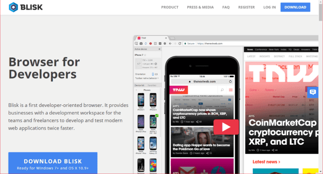
Speaking of Device View, the Blisk Team thought the best way to view a mobile responsive website is to add tools to a browser engine. What better place to put rendering tools to assist with responsive sites?
Blisk is a new tool that I recently discovered and mentioned in four browsers you've never heard of that weren't part of the Fabulous Five (ya know...that might stick). ;-)
Blisk expands on the DevTools and, for an extra charge, you can receive a number of device profiles to assist you with your mobile development. They offer almost 30 device profiles you can use in the Blisk browser.
But Blisk offers more than just profiles as well.
- Side-by-side View
- Scroll Sync
- Auto Refresh
- Screenshots
- Screen Recorder
The amount of tools in this browser is what web developers need when writing responsive web applications.
4. ECMAScript Compatibility Table
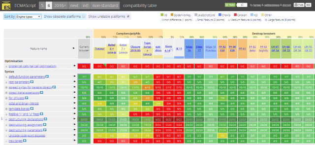
When one is using JavaScript/ES5/ES6, you can't possibly know whether arrow syntax is supported or RegExp "y" and "u" flags are supported in all browsers.
I have this site bookmarked to assist with PWAs.
Whatever browser you are currently using, the first column tells you what is supported, what you can and can't use, and also compare it to every other browser in the list.
A great reference for JavaScript heavy developers who work with responsive mobile websites.
5. CanIUse.com
With JavaScript continuing to bring near-native experiences to the smartphone, some features are coming along for the ride.
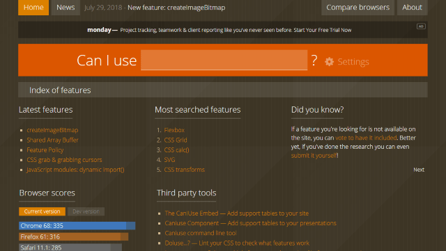
CanIUse.com lets you search for specific technologies (camera, local storage, etc.), CSS terms (CSS Grid, CSS calc(), etc.), and JavaScript terms (modules, arrow syntax, etc.) to determine if you can use it in your mobile applications.
For example, if you head over to the site and to the right of the Can I Use label, type in "media capture", this will let you know which browsers have the ability to capture media from a camera, microphone, or file upload.
Knowing this up-front will help immensely when writing a mobile responsive app with hardware compatibility.
6. Bootsnipp
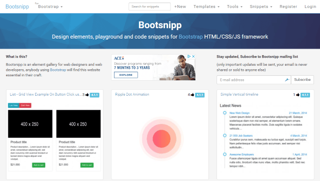
Remember when I said Bootstrap has a large following? Bootsnipp is proof of that.
Bootsnipp is a site containing Bootstrap snippets to grab and use in your Bootstrap-built mobile website.
It provides a number of different categories to rummage through, and once you find the design you like, you can examine the HTML, CSS, and/or JavaScript and learn how to implement it on your own site.
There are other sites similar to Bootsnipp, but they seem to have the most Bootstrap snippets available.
7. Test My Site by Google
Ever since Google's Mobilegeddon, people were wondering how to test their sites so they look fantastic on mobile devices.
With all of the changes, why not let Google examine your site and tell you what's wrong with it? Google to the rescue.
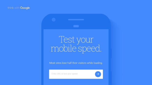
One of the tools to help optimize your site is the Test My Site by Think With Google.
This tool examines your site by running diagnostics for
- Checking HTML/CSS
- Running JavaScript
- Check for speeds using a standard 3G connection
- Detecting image compression
- Mobile usability
- Comparison against other sites in your industry
- Checking page load speeds
After it's done, it provides a free report of your top fixes you can implement on your site to make it faster and usable to mobile users.
An absolutely great tool.
8. Lighthouse
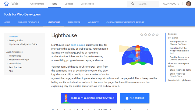
Speaking of Google, they also created an open-source automated tool for improving the quality of web pages (not that Test My Site isn't good enough).
If you have Google Chrome, you already have the tool installed. Navigate to a page you want to evaluate, press F12, and click the Audits tab to get started.
If you don't have Google Chrome (What's wrong with you? ;-)), you can run it from a command line, or as a Node module. The site explains how to perform each of these options.
After a couple of minutes running Lighthouse, you receive a customized report of your site.
Examine the results and start taking action to achieve a high score of 100 from Google.
9. Your Editor
I know this is a cop-out, but you'd be surprised how much your IDE is starting to work towards a mobile mentality.
- Visual Studio Code - The IDE is built with Electron using HTML, CSS, and JavaScript to create websites with HTML, CSS, and JavaScript. How much more responsive do you want to get with your IDE? ;-)
- Visual Studio - The full-blown Microsoft IDE which includes Xamarin for their native mobile development efforts, scaffolding to build SPAs and PWAs, and a responsive website built with Bootstrap when you create a new ASP.NET Core project.
- WebStorm - Jetbrains included a REST-based client in WebStorm for testing and it also has a plethora of plug-ins to work with Angular, Aurelia, Meteor, Ember, React, and so much more for mobile development.
Development companies recognize the importance of mobile websites and continue to build new features into code editors to make the creation of mobile sites easier.
10. Viewport Resizer
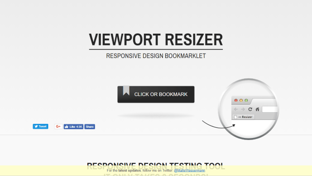
While I haven't used this in a while because of Google Chrome's Device Toolbar and Blisk's device profiles taking it's place, I've always liked the Viewport Resizer.
Click-and-drag the bookmarklet to your bookmark toolbar. Visit the site you want to test and click the bookmarklet.
The Viewport Resizer displays a bar across the top with devices you can click to see if the site is responsive.
Still a great tool.
BONUS: 11. Web API Testers
As Marc Andreessen mentioned back in 2011, software is eating the world, but lately, it's more like web API's are eating the world.
First, it was SOAP.
Now, REST-based APIs is the new "hotness" because we need to call a web API from our PWA, SPA, or jQuery application (hmm...can I add any more acronyms to this sentence?)
Usually, a back-end team builds the API and then notifies the front-end team of the API so they can connect to it and test it to build out the UI properly.
So developers requested the proper tools for testing APIs.
The primary tools used in the wild for testing APIs are:
SOAP UI
A full-fledged IDE meant entirely for building SOAP and REST-based requests. There is an open-source and paid version of the tool.
Postman IDE
Another great IDE to build SOAP and REST-based requests. Also an open-source and paid version of the tool.
WebStorm
As I mentioned above, JetBrains recently added a new REST client to their WebStorm web development tool so you don't have to leave your IDE for testing web APIs.
Personally, I use SOAP UI at work and WebStorm at home, but I'm sure everyone has their preferences. ;-)
BONUS: 12. W3C mobileOK Checker
At first, I used the W3C Mobile Checker, but it became disabled (Wah-Wah!)
So i started using W3C mobileOK Checker.
Plug in your URL and mobileOK Checker will report on all of the issues you have on your site.
However, be prepared. It's not as forgiving as Google or some other site tune-up engines. This is THE site to make sure your site is mobile-compatible and you follow standards by the organization who implemented the web.
Conclusion
While I didn't even come close to the amount of mobile tools out there, I'm definitely sure I missed some.
Mobile tools are becoming more important as the amount of smartphone users expands rapidly across the globe.
EVERYONE is using their phone for the Internet.
Some people don't even have a computer or laptop with a router or Internet service in their house. They only have their phone along with a unlimited data plan to access the Internet.
...and yes, I'm talking about you, Brink!
What mobile tool do you use when building mobile sites? Did I miss a really big tool everyone uses but me?Post your comments below and let's discuss about mobile tools.


